

This is a picture of a kid's bedroom. I like the pop-art feel. For some reason it makes me think of Lichtenstein? I think the shelf is a creative divider of sorts between the beds. Besides the decor, the furniture is really basic & looks like it could be purchased at Ikea. I really adore the primary colors and polka dots, and while it would drive me crazy now, I think I would have really loved it as a child.

This kitchen is the color of atomic vomit, and I couldn't love it more. The awful kinda mustardy yellow and grass green are the kitschiest color combo. I think my favorite detail is how the wallpaper continues onto the ceiling. Or maybe the rainbow striped floor? Hmm...

I don't even know where to start with this bathroom. Yes, I said bathroom. Majestic, isn't it? The lush white shag carpeting and shiny silver accents are nothing compared to the circular architecture. Space-agey, if I do say so myself! I love how the tub is the focal point in the room, and how it has shower curtains only on two sides. Oh how I would adore having the sit down hair drier (tucked away next to the toilet with the magazine rack). However, how this bathroom is any sort of "practical" is unknown to me.

The first thing I like about this room is the shelving. I love wall shelving and I love that it is not only in one spot in the room but covers the whole wall. Anyone who knows me should know of my fondness for kitschy collectibles. AND HELLO. WHOLE WALL FULL OF 'EM. Also, I really like the typical 70's fireplace. They sure don't make them like that anymore!
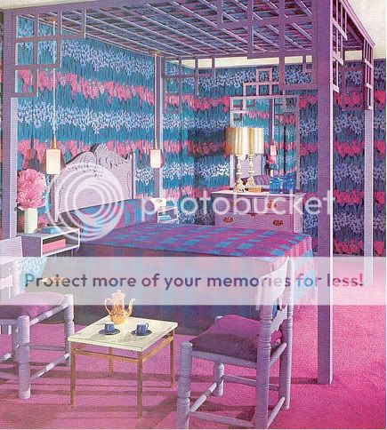
The color palate of my dreams! I really like the unconventional bed frame/canopy, and how the detail on the top of the dresser matches. I am totally digging the wallpaper. What a ridiculous pattern! They really stick to the purple, blue, and pink theme nicely, but the gold of the teapot and lamp definitely help to mix it up and make it not as monotonous.
Someone wanna purchase me the 18 volume hardback set on Amazon? You know I will love you forever.
(Pictures from the Flickr photostreams of Naughty Secretary Club & Super*Junk. THANKZ)
1 comment:
The yellow and green wallpaper in the second photograph is a little too much I think. But the bathroom, wow! The circular structure is really only the beginning of its uniqueness.
Post a Comment